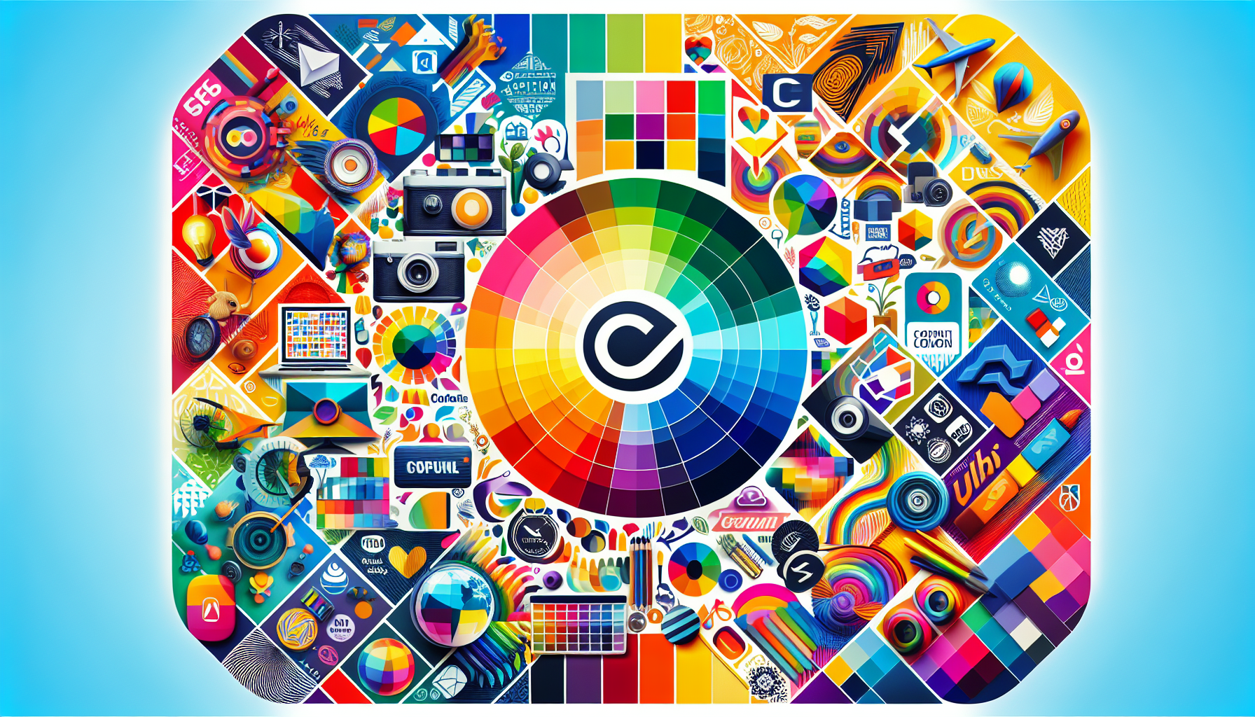
Colors play a profound role in shaping our perceptions, emotions, and actions, particularly in the realm of branding. While often underestimated, the strategic use of color can deeply influence consumer behavior and significantly enhance brand identity. Understanding color psychology can empower businesses to create more impactful and emotionally resonant brands.
Color psychology suggests that colors are more than just visual stimuli; they evoke specific emotional responses and associations that can influence consumer decisions. For instance, red, often associated with passion, excitement, and urgency, is frequently used by brands aiming to stimulate strong emotional responses. This is why many fast-food chains incorporate red into their logos and interiors—to encourage quick decision-making and convey energy.
Blue, on the other hand, is typically connected with trust, calmness, and stability. Many banks and tech companies use blue in their branding to instill a sense of reliability and security. This psychological association makes blue an ideal choice for industries where trust is paramount, helping consumers feel more confident in their decisions.
Green, synonymous with nature and health, is prominently used by brands that want to emphasize eco-friendliness or promote wellness. This color can evoke a sense of peace and balance, making it a popular choice among companies in the health or environmental sectors.
Yellow, representing happiness and optimism, can grab attention quickly. It’s often used to create an emotional uplift and is a favorite in industries focused on leisure or entertainment. Meanwhile, luxury brands often opt for black or purple to convey sophistication and exclusivity, tapping into the subconscious desire for premium and exclusive experiences.
When applying color psychology to branding, it’s crucial to consider not only the color itself but also its cultural implications and its relation to your target audience. What works in one region or context might not have the same impact in another. For example, while white is associated with purity and simplicity in Western cultures, it is often linked to mourning in some Eastern cultures.
Moreover, consistency is key. The colors you choose should align seamlessly with your brand's message and values across all platforms and touchpoints. This ensures that your audience develops a cohesive and lasting impression of your brand. Therefore, it’s beneficial to create a color palette that reflects the brand’s essence and can be utilized consistently in marketing materials, web design, product packaging, and more.
Another important consideration is contrast and harmony. While choosing your brand’s signature colors, remember that contrasting colors can draw attention and create visual interest, while harmonious colors promote comfort and ease. This balance can be particularly important in digital design, where readability and user experience are crucial.
In conclusion, the strategic use of color can enhance brand recognition, convey desired emotions, and influence consumer behavior. By understanding the psychology behind colors and thoughtfully integrating them into your branding strategy, you can create a powerful and emotionally resonant brand that captivates and connects with your audience. Whether you aim to excite, reassure, energize, or calm your customers, the right choice of colors, aligned with your brand’s values and message, can make a significant impact.